Creating a new section
In this guide, you will learn how to create a new section for your storefront and make it available in the Headless CMS. This solution is useful when your project requires a section not natively available in FastStore.
For this guide, we will create two sections:
-
Call to ActionGets a specific action from the user. -
OurStores: Indicates the closest store for the user.Sections are page components that wrap up other components, enabling you to create cohesive and functional content for your store. For example, the Hero section is a native section that includes the following components:Hero,HeroImage, andHeroHeader.
Before you begin
1. Integrate the store with the Headless CMS
All sections must be available in the Headless CMS so they can be added and managed on your store's pages. To integrate your FastStore project, please refer to the Headless CMS integration track.
2. Knowledge of how sections and content types work on Headless CMS
During the creation of a new section, you will create files such as
sections.json and content-types.json, which follow a structure established for the Headless CMS.3. Install the FastStore CLI
Make sure to install the FastStore CLI to use its commands locally. Refer to the FastStore CLI guide for more information.
Call to Action
Step 1: Creating folders and files related to the Headless CMS
- In the FastStore root directory, create a folder named
cms. - Inside
cms, create thefaststorefolder. - Within the
cms/faststorefolder, createsections.jsonfile. - In the
sections.jsonfile, add the new section that you want to display in the Headless CMS. The schema below defines how the Headless CMS renders a section:
This new section receives a title and a link pointing to a specific location.
Step 2: Creating the new section
To render the
CallToAction section you created in the previous step, you need to create this section component.- If you don't already have it, create a folder named
componentsinside thesrcdirectory. - Inside the
componentsfolder, create a file namedCallToAction.tsxand add the following code:
This section will receive the
link and title defined previously in the sections.json file.- Create a file named
index.tsxinside the components folder.
Theindex.tsxfile provides an entry point for importing and using theCallToActioncomponent. It acts as a container for all the components within the components folder and allows for easier organization and reusability of code.
Open the
index.tsx file and add the following code:Step 3: Synchronizing the new section with the Headless CMS
- In the terminal, run
faststore cms-sync. This command will synchronize the new section you created with the CMS. - Go to the VTEX Admin and access Storefront > Headless CMS.
- Click on the
Pagecontent type.
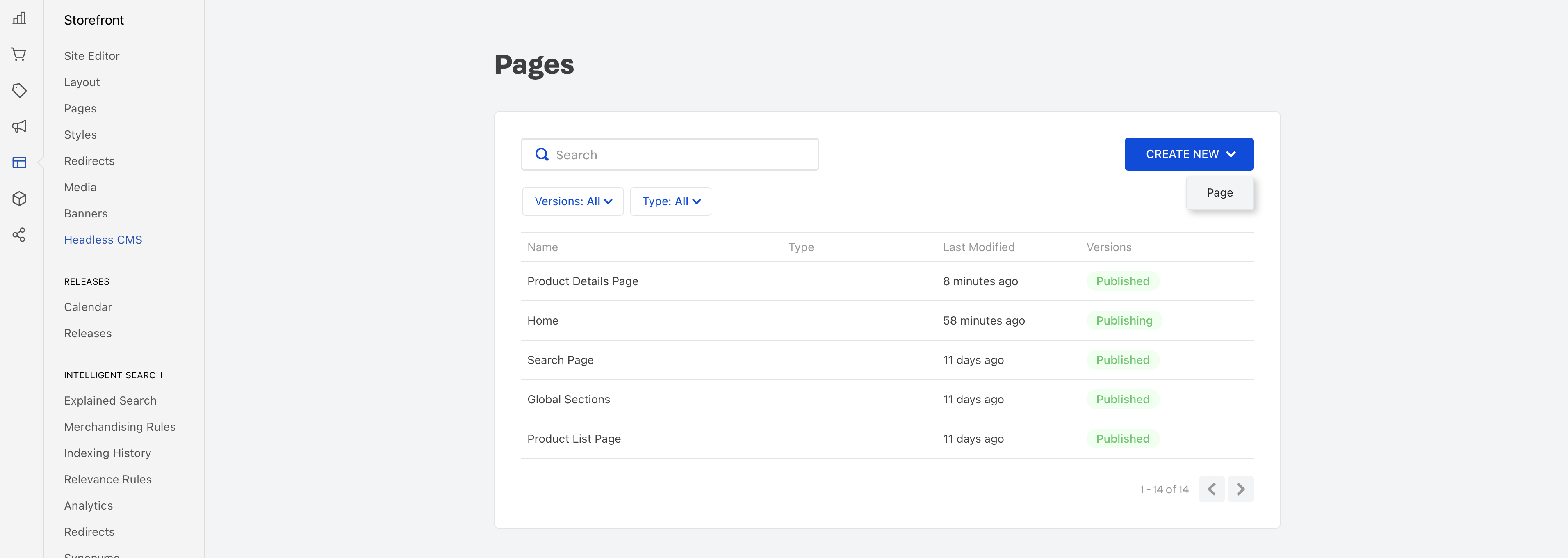
- In the
Sectionstab, click the+, search for the newCall to Actionsection, and add it to your page.
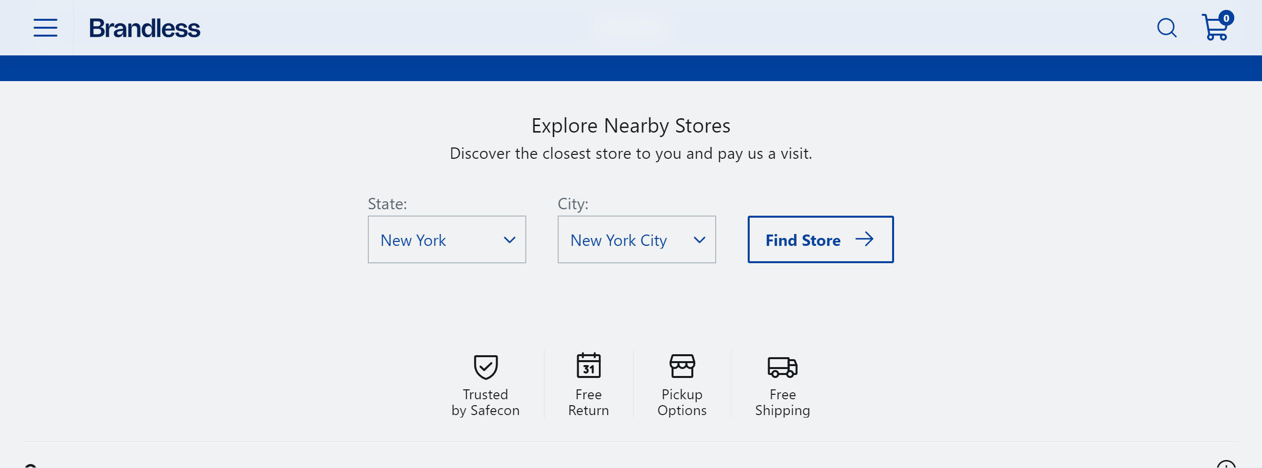
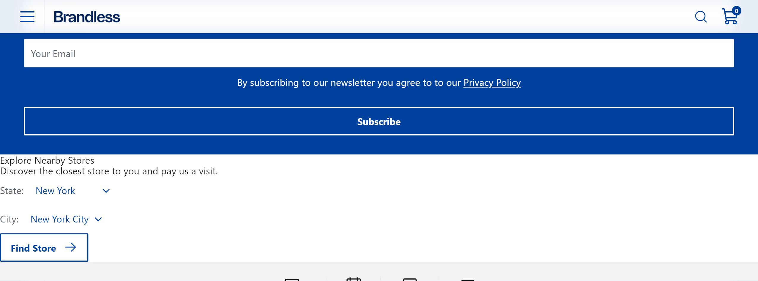
OurStore
- After creating the files and folders, In the
sections.jsonfile, add the new section that you want to display in the Headless CMS. The schema below defines how the Headless CMS renders theOurStoressection that we will use in the example:
- Inside the
componentsfolder, create a file namedOurStores.tsxand add the following code:
For this section, we will use the following components from the Faststore UI: Button, Icon and SelectField.
- Create a file named
index.tsxinside the components folder, and add the following code:
- Repeat the steps in Step 3: Synchronizing the new section with the Headless CMS, and you should see the new section but without styles as in the example below:
To add styles to
OurStore, refer to the following section Importing styles when creating a new section.Adding styles to a new section
After creating a new section, you can style it to match your store's branding. Follow the steps below using the
OurStores section as an example.Instructions
- In your store code, open the
componentsfolder and create a.module.scssfile for your component. For example, if your component isOurStores, name the fileourStores.module.scss. This file will contain the styles specific to this section. - Import the necessary FastStore UI styles into your
.module.scssfile. For example, to style theOurStorescomponent, we imported the styles for the Button and SelectField components. TheSelectstyles are also imported sinceSelectFieldinherits them.
- Open the component's
.tsxfile. For example,OurStores.tsx. - Import the newly created stylesheet into the component:
- Open the terminal and run
yarn devto see your changes.
- Add more styles to the section by using design tokens and component-specific data attributes to the
.module.scssfile:
- Update the component's file by adding the appropriate CSS classes to elements, ensuring they align with the newly defined styles in your stylesheet. For example:
- Navigate to
http://localhost:3000in your browser to see the updated component with the applied styles.